Transforming CaeNDR
Turning a homegrown lab notebook into a global research platform wasn’t just a technical challenge; it was a complete identity shift for a community of scientists. Here’s how I reimagined a website to meet the demands of the world’s top geneticists.
Transforming CaeNDR
Turning a homegrown lab notebook into a global research platform wasn’t just a technical challenge; it was a complete identity shift for a community of scientists. Here’s how I reimagined a website to meet the demands of the world’s top geneticists.
Role
Senior UX/UI Designer, Front-End Developer
Timeline
September 2022 to May 2023
Team
2 developers, 1 team lead, 1 UX Designer
Organization
Northwestern University
Role
Senior UX/UI Designer, Front-End Developer
Timeline
September 2022 to May 2023
Team
2 developers, 1 team lead, 1 UX Designer
Organization
Northwestern University
Role
Senior UX/UI Designer, Front-End Developer
Timeline
September 2022 to May 2023
Team
2 developers, 1 team lead, 1 UX Designer
Organization
Northwestern University

Overview
Overview
Context
Dr. Erik Andersen had a problem most researchers would envy.
His C. elegans nematode database, elegansvariation.org, became so valuable in the genetics community that the National Science Foundation (NSF) awarded him additional funding to expand it. But success brought an identity crisis.
What started as an internal lab notebook that was maintained by graduate students between experiments now needed to serve 1,000+ specialized researchers across genetics, developmental biology, and neurobiology at top universities worldwide. The platform had to support not just one species, but three: C. elegans, C. briggsae, and C. tropicalis.
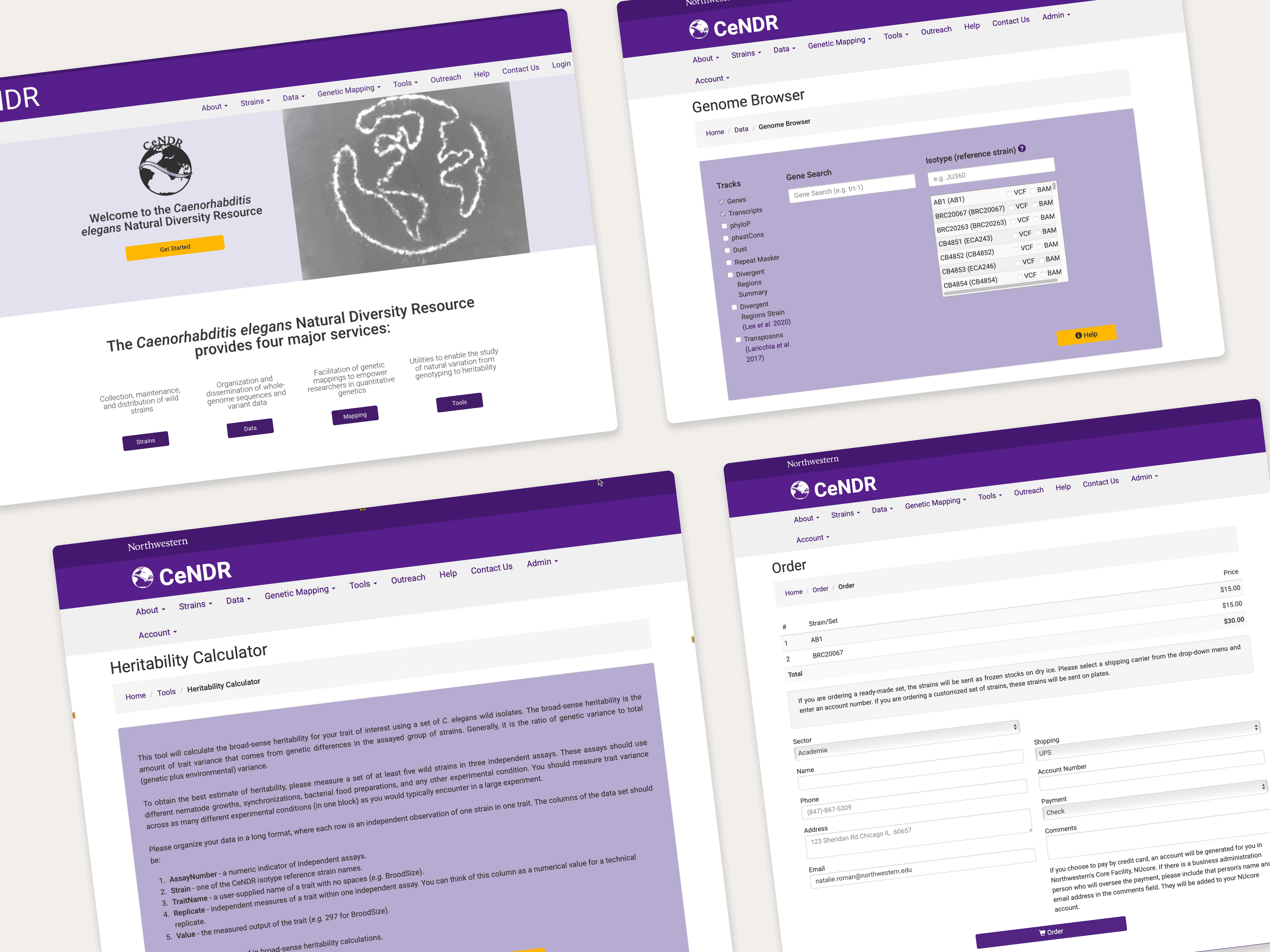
The original elegansvariation.org site designed by grad students
Problem
💡 How do you transform an ad-hoc academic website into a professional research platform that serves a highly specialized global audience while meeting NSF compliance requirements?
Context
Dr. Erik Andersen had a problem most researchers would envy.
His C. elegans nematode database, elegansvariation.org, became so valuable in the genetics community that the National Science Foundation (NSF) awarded him additional funding to expand it. But success brought an identity crisis.
What started as an internal lab notebook that was maintained by graduate students between experiments now needed to serve 1,000+ specialized researchers across genetics, developmental biology, and neurobiology at top universities worldwide. The platform had to support not just one species, but three: C. elegans, C. briggsae, and C. tropicalis.
The original elegansvariation.org site designed by grad students
Problem
💡 How do you transform an ad-hoc academic website into a professional research platform that serves a highly specialized global audience while meeting NSF compliance requirements?
Design Process
Design Process
The Stakeholder Revelation: Understanding True Value
I began by interviewing Dr. Andersen to better understand the tools offered on the site, the data requirements, and how CaeNDR fits into the larger scientific community.
These conversations revealed many insights. One of the most important was that Dr. Andersen revealed CaeNDR's unique value proposition which wasn't obvious from the interface: it's the only nematode database ensuring genetic diversity through global sample collection.
Most lab strains come from the same cultivated lines, but CaeNDR maintains samples from wild populations worldwide.
This insight completely changed my homepage design strategy, highlighting the global, diverse nature of the research rather than just listing available tools.
Homepage Redesign
A map shows the location of where nematode strains were collected for all 3 species. This information was readily available in the datasets but wasn’t previously utilized.
Users can filter the map by species.
Each species is coded with a different color. These colors are used throughout the site to differentiate species.
Clicking on individual pins shows a modal with further information about the selected strain.
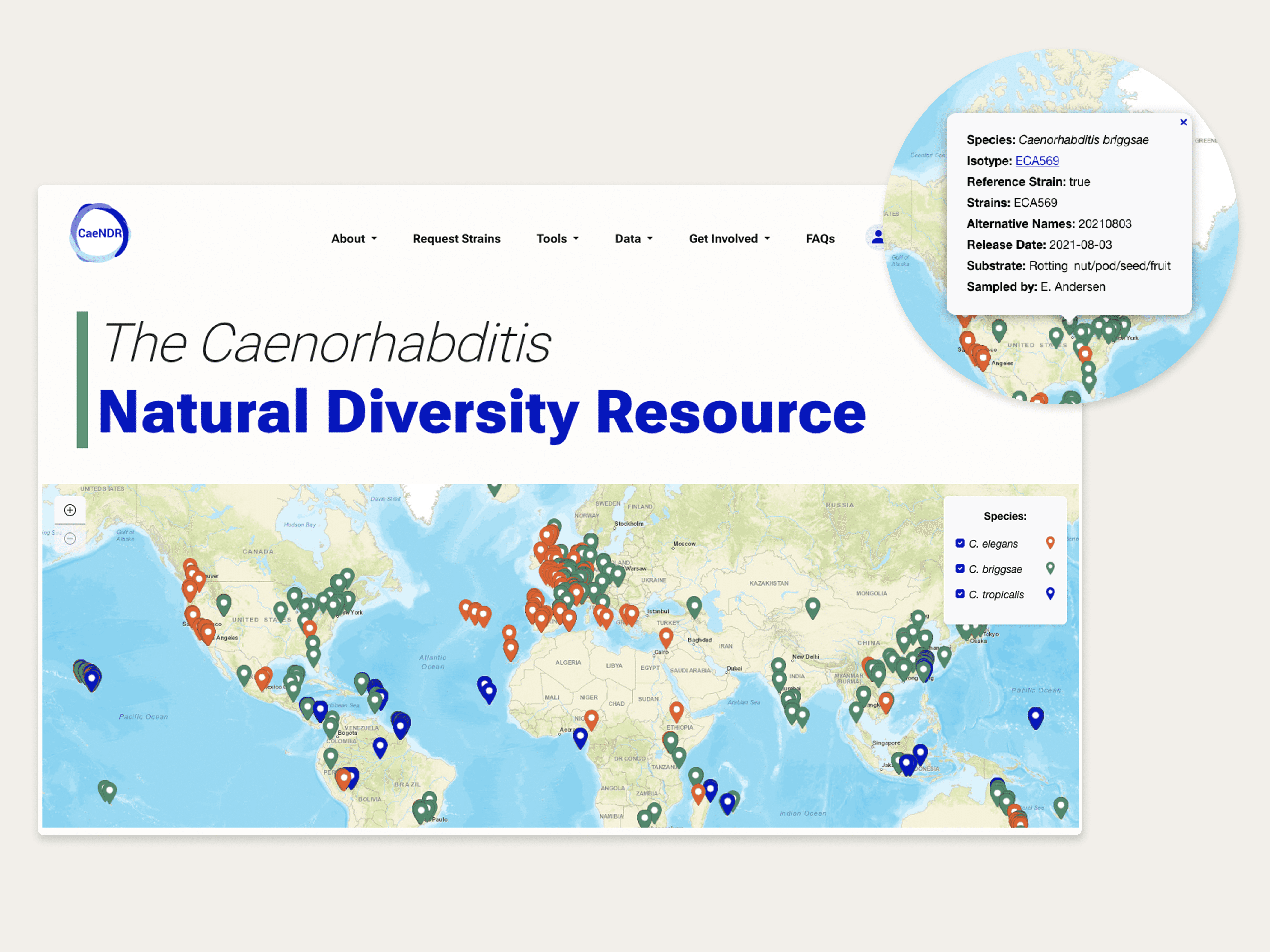
The redesigned CaeNDR homepage
Hidden Complexity: Why Scientists are Different Users
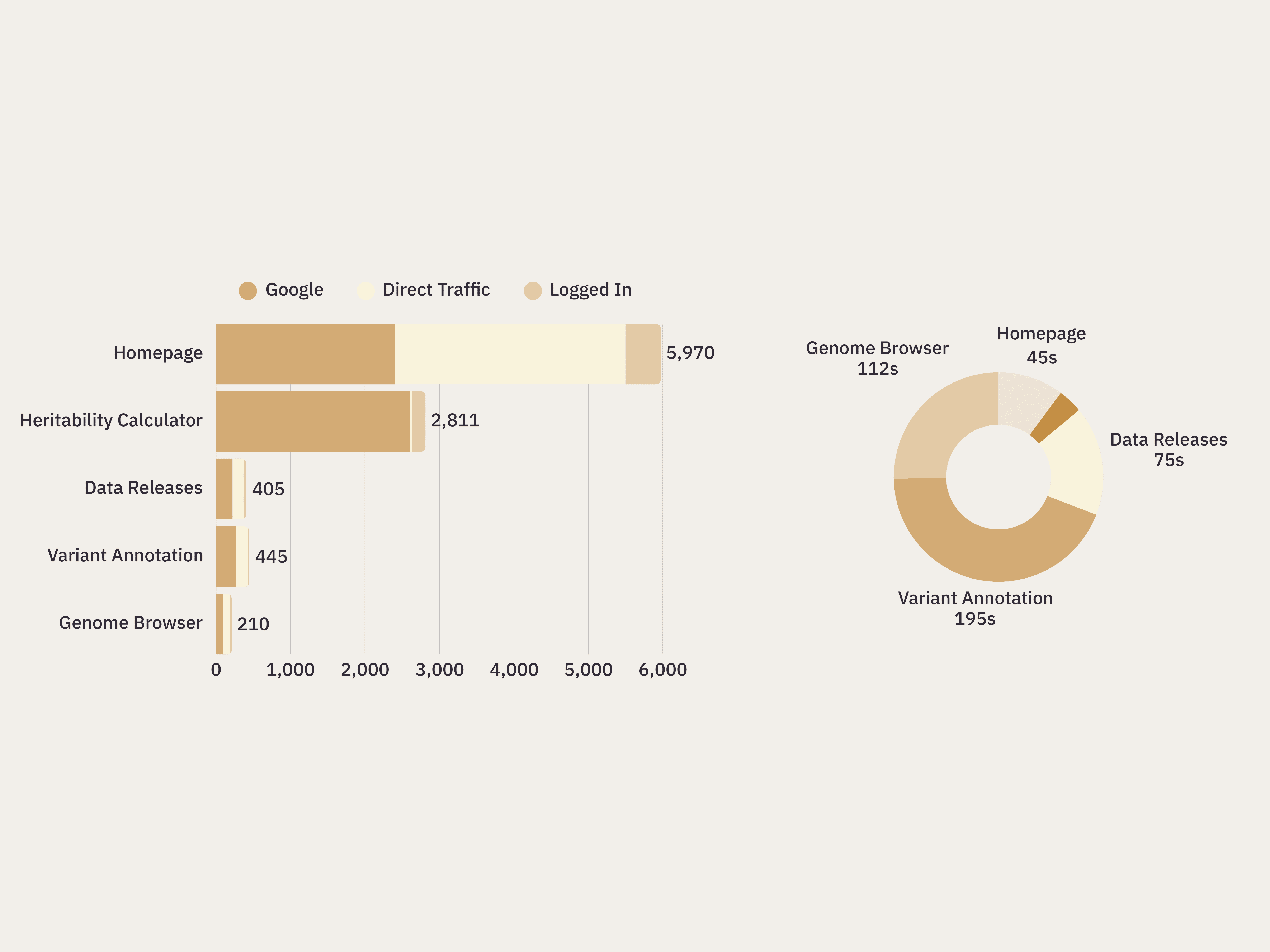
Genomics researchers have different usage patterns than typical users. Google Analytics revealed something fascinating: users were laser-focused on specific tasks. They'd arrive, use one tool and then immediately leave without exploring other resources.
Conversations with Dr. Andersen revealed that this wasn't poor UX; it was the nature of scientific workflows that can span 2-4 years. A researcher might use the Genome Browser once in 2022, then not return to use another tool until 2024 when their experiment reached the next phase.
Google Analytics revealed...
3 out of 5 tools on the site are in the top 5 pages overall: Heritability Calculator, Variant Annotation, and Genome Browser.
This indicates that users overwhelmingly visit for the tools, with some users even relying on bookmarks or direct URLs for access.
High exit rates suggested either that users were experiencing usability issues or were solely task-oriented on their one tool.
Higher time spent on the Variant Annotation tool supported the hypothesis that CaeNDR’s users were task-oriented and engaging with tools.
Note: Heritability Calculator has low time on page due to a registration requirement to contain cloud-processing costs due to intensive data usage.
Strategic Testing Reveals Hidden Navigation Issues
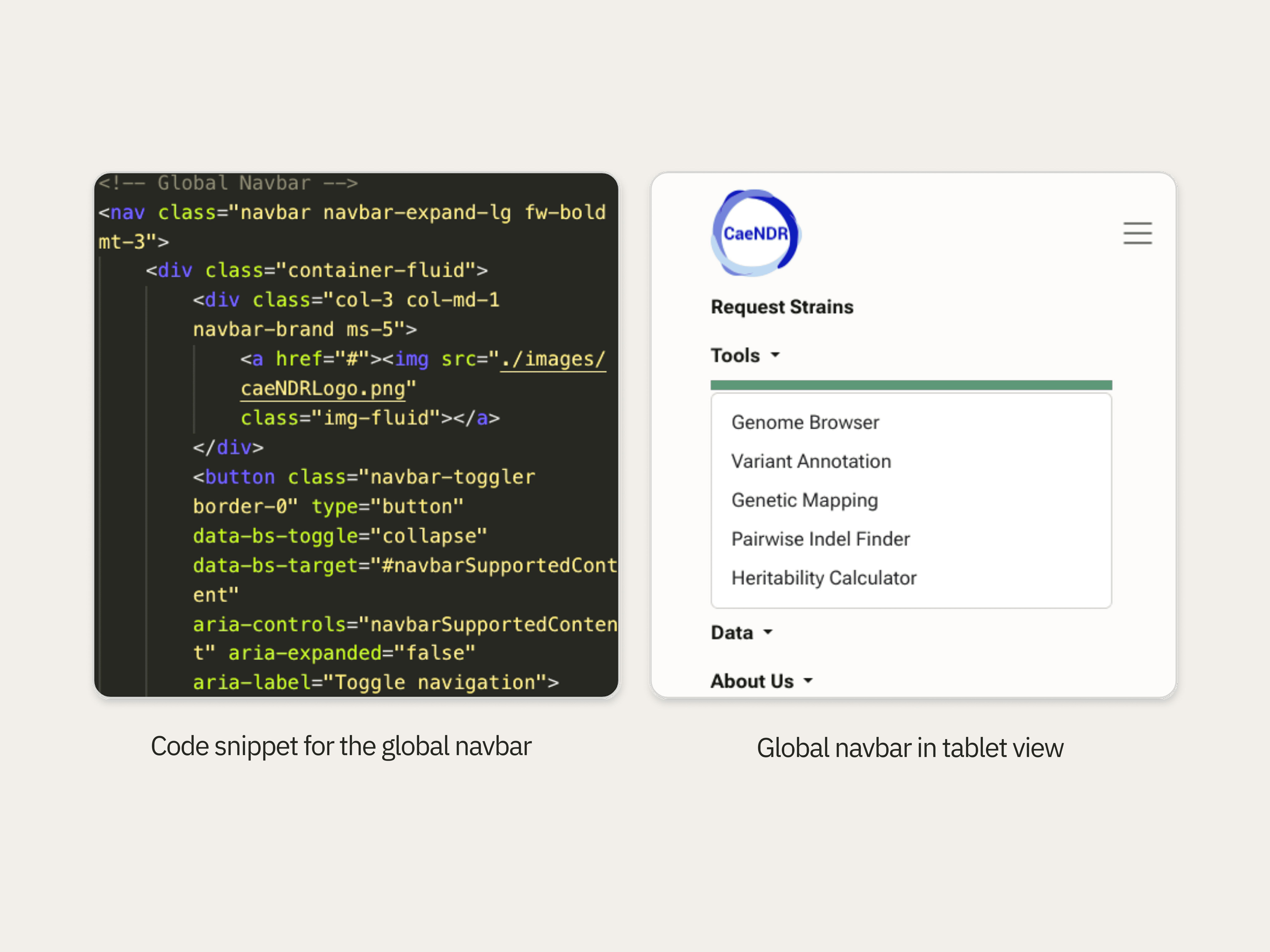
Based on these insights, I streamlined the site’s navigation to promote quick access to tools and datasets.
A content audit of the original site revealed that tools were spread out amongst several different top-level navigation categories, which was inefficient for task-oriented users.
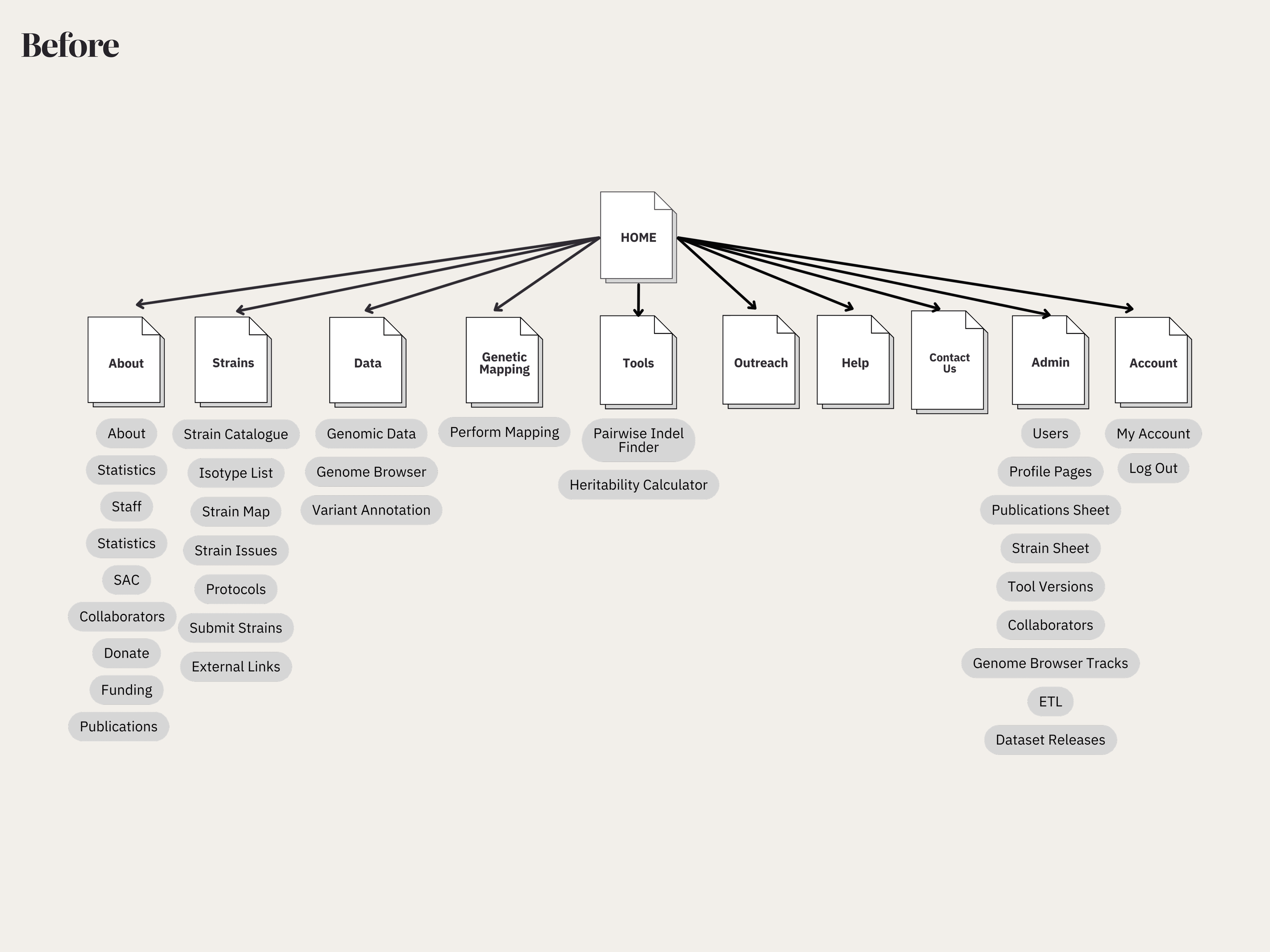
I proposed a new site navigation which clearly separated tools and datasets, and listed tools in the order in which they are used in the scientific workflow.
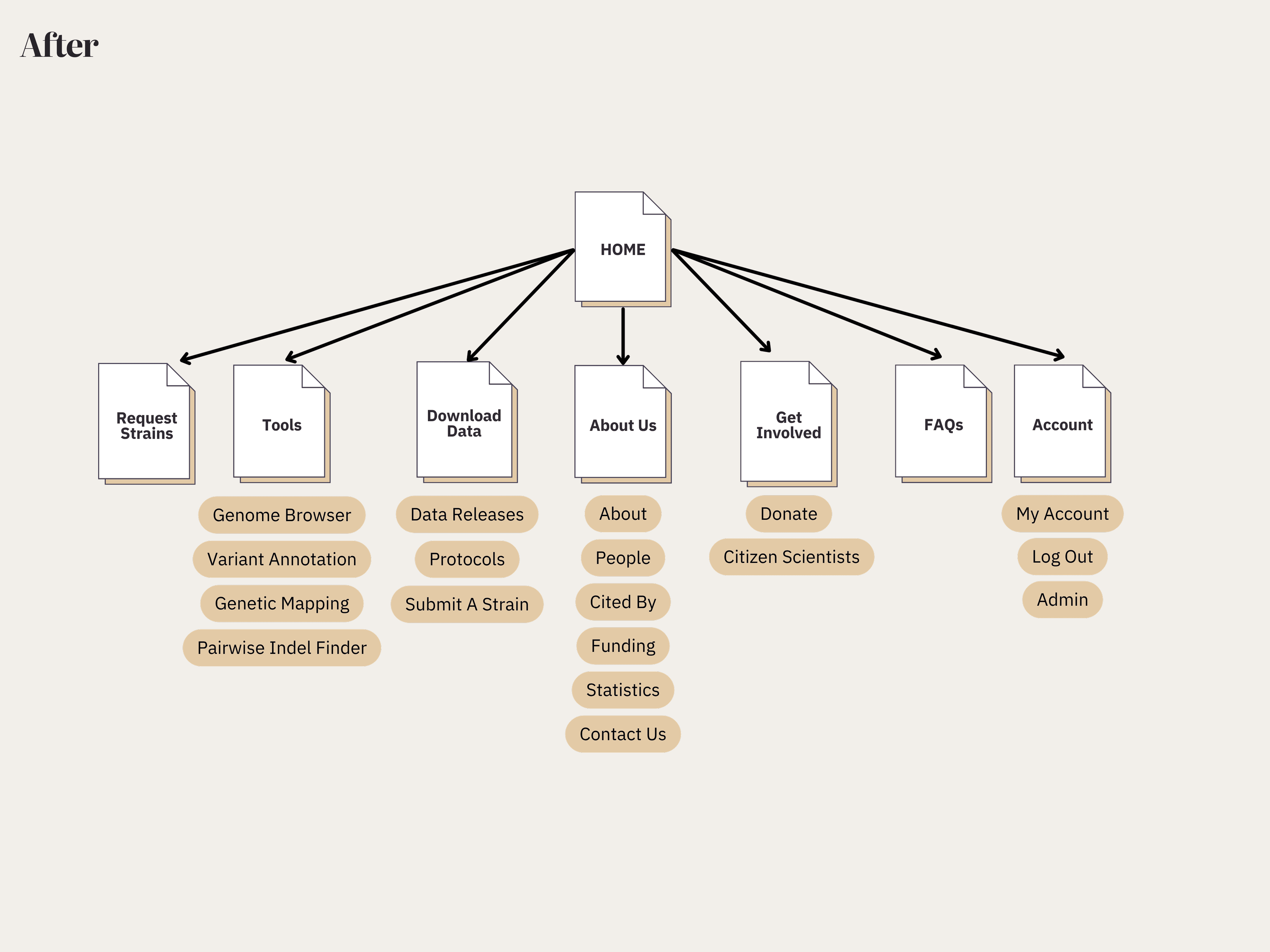
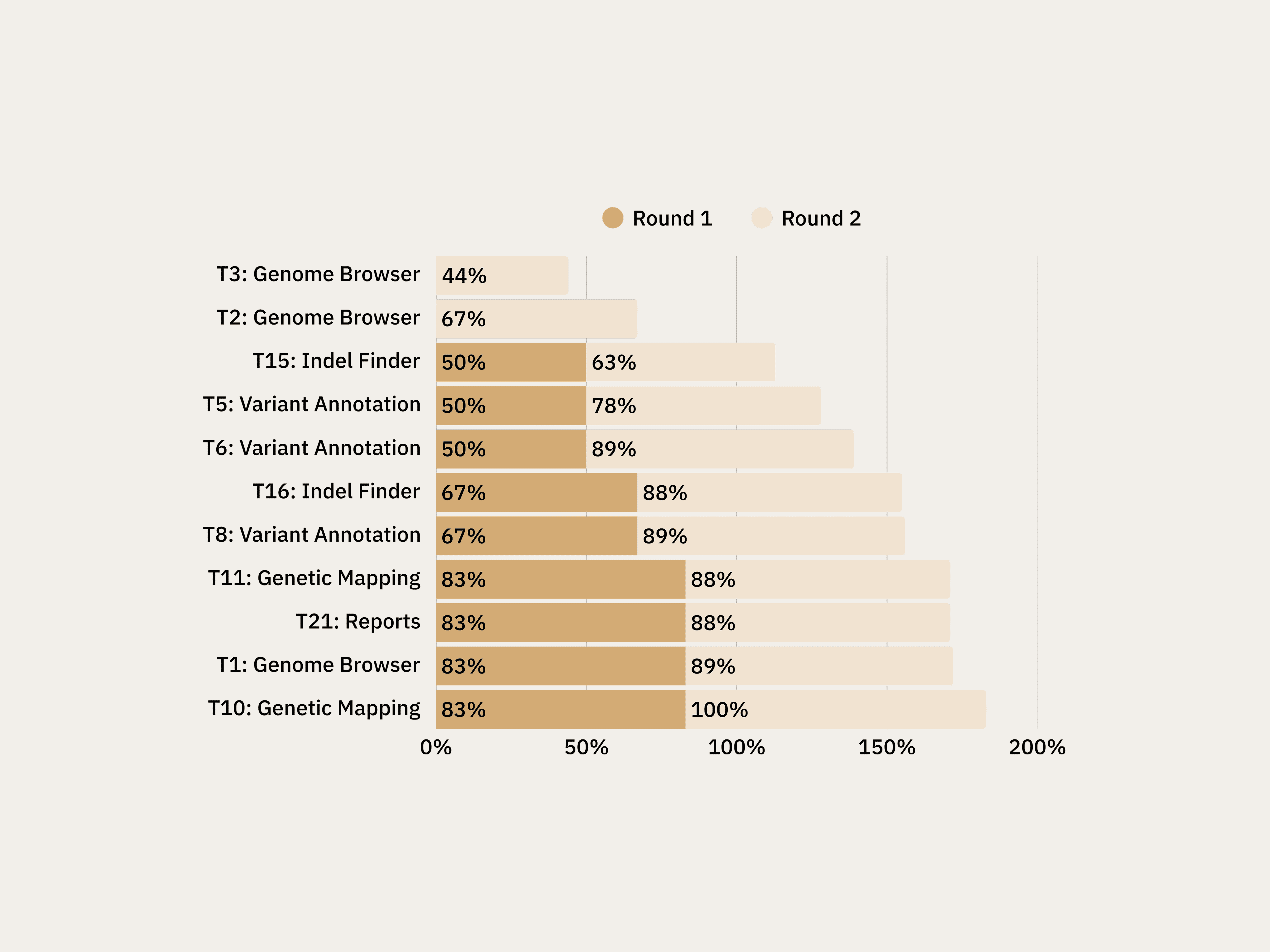
I validated the new navigation by conducting tree testing with 15 participants across 10 key tasks.
While most tasks achieved impressive 80-93% success rates, a couple of critical gaps emerged:
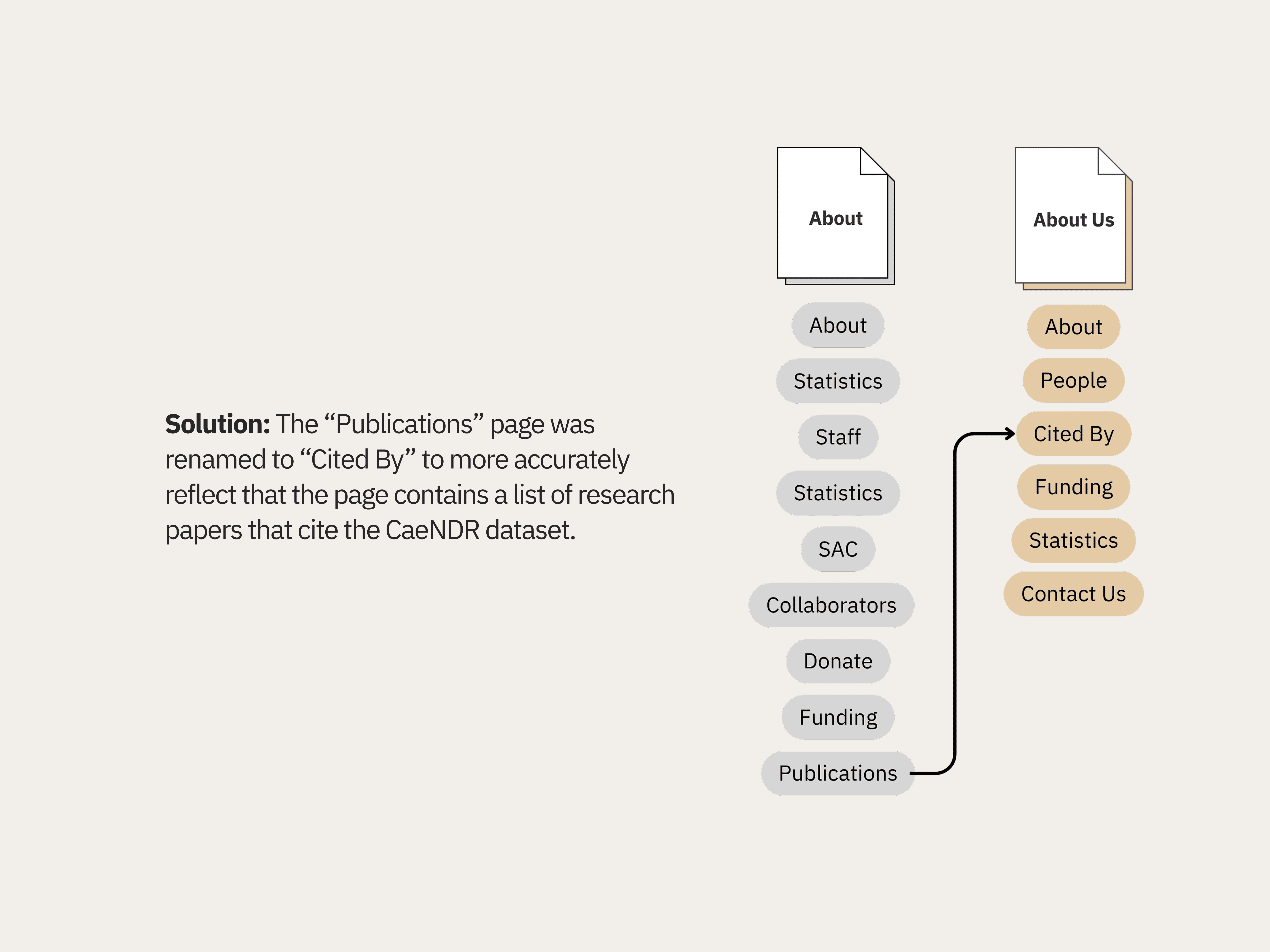
The Publications Confusion
Users weren't sure if the "Publications" page contained CaeNDR's own research or papers that had cited the platform, a crucial distinction for academic credibility.
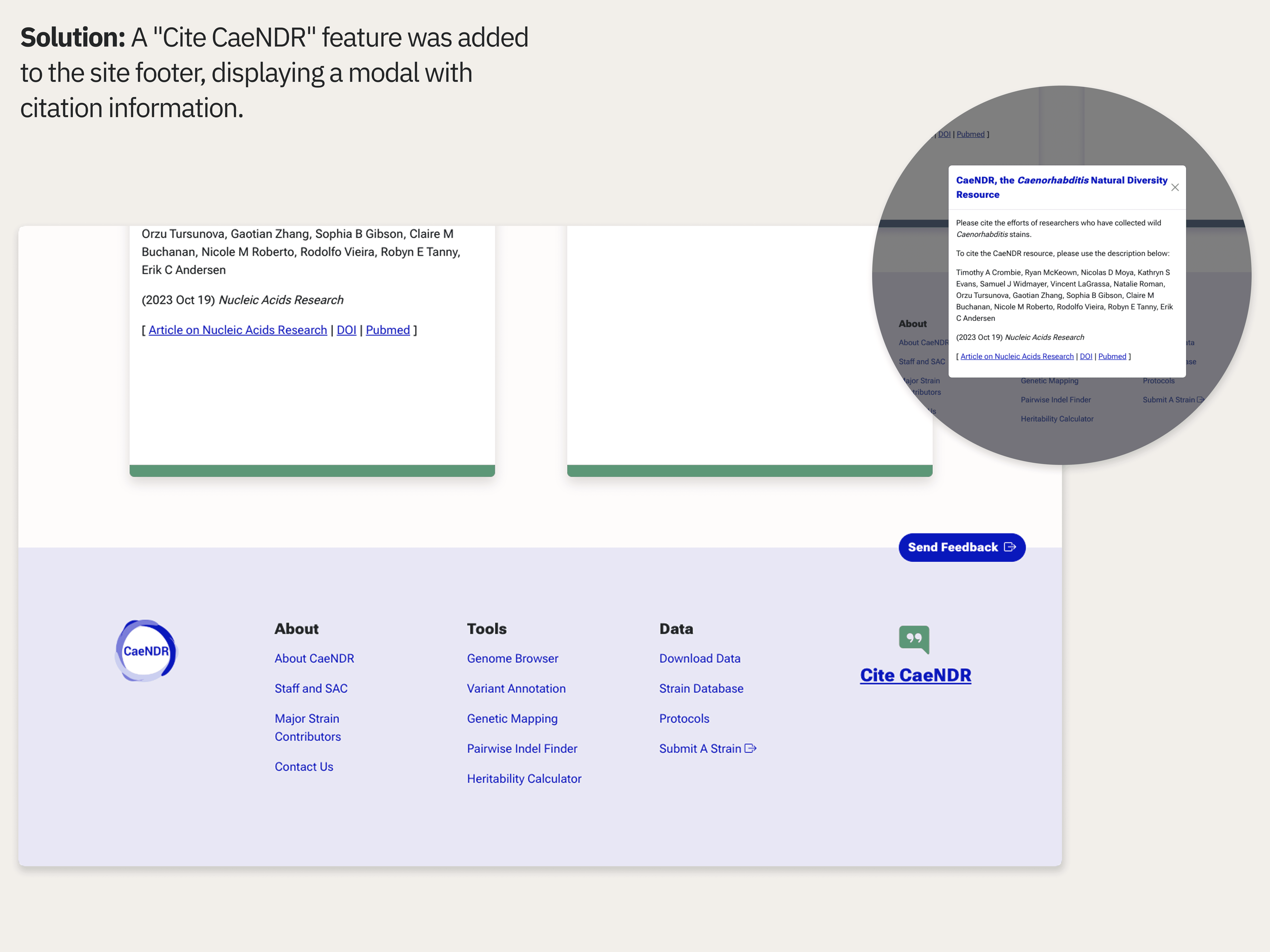
The Citation Problem
Only 60% of users could find citation information, with participants scattered between Tools, About Us, and FAQ sections. For researchers who need to properly cite data sources in publications, this was a significant barrier.
The Species Selection Problem: Testing Assumptions
I then redesigned the tool interfaces, applying fundamental design principles and patterns to interfaces which had been created by non-designers.
One of the biggest design challenges came from what seemed like a simple addition. For years, users never had to select a species. C. elegans was the default option. Now, with three species, every tool needed a species selector.
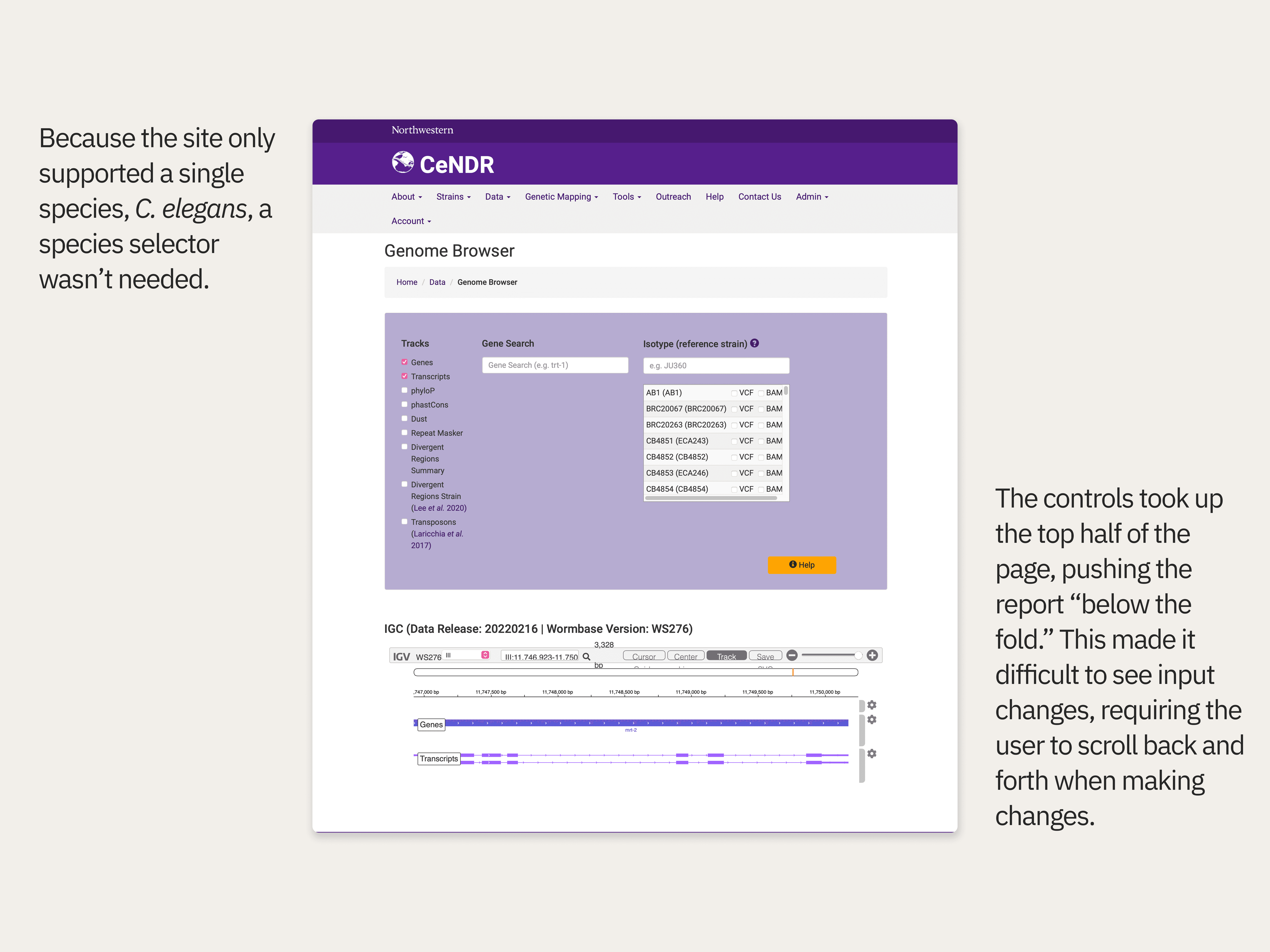
Before: Tool interfaces were designed by graduate students; inputs and controls weren’t grouped thoughtfully according to standard design patterns.
First-click testing revealed a problem: 0% success rate on species selection. Users who remembered the old interface couldn't adapt to the new required selection when hidden in a panel. Users instead proceeded to try to select a gene first, as was the previous workflow.
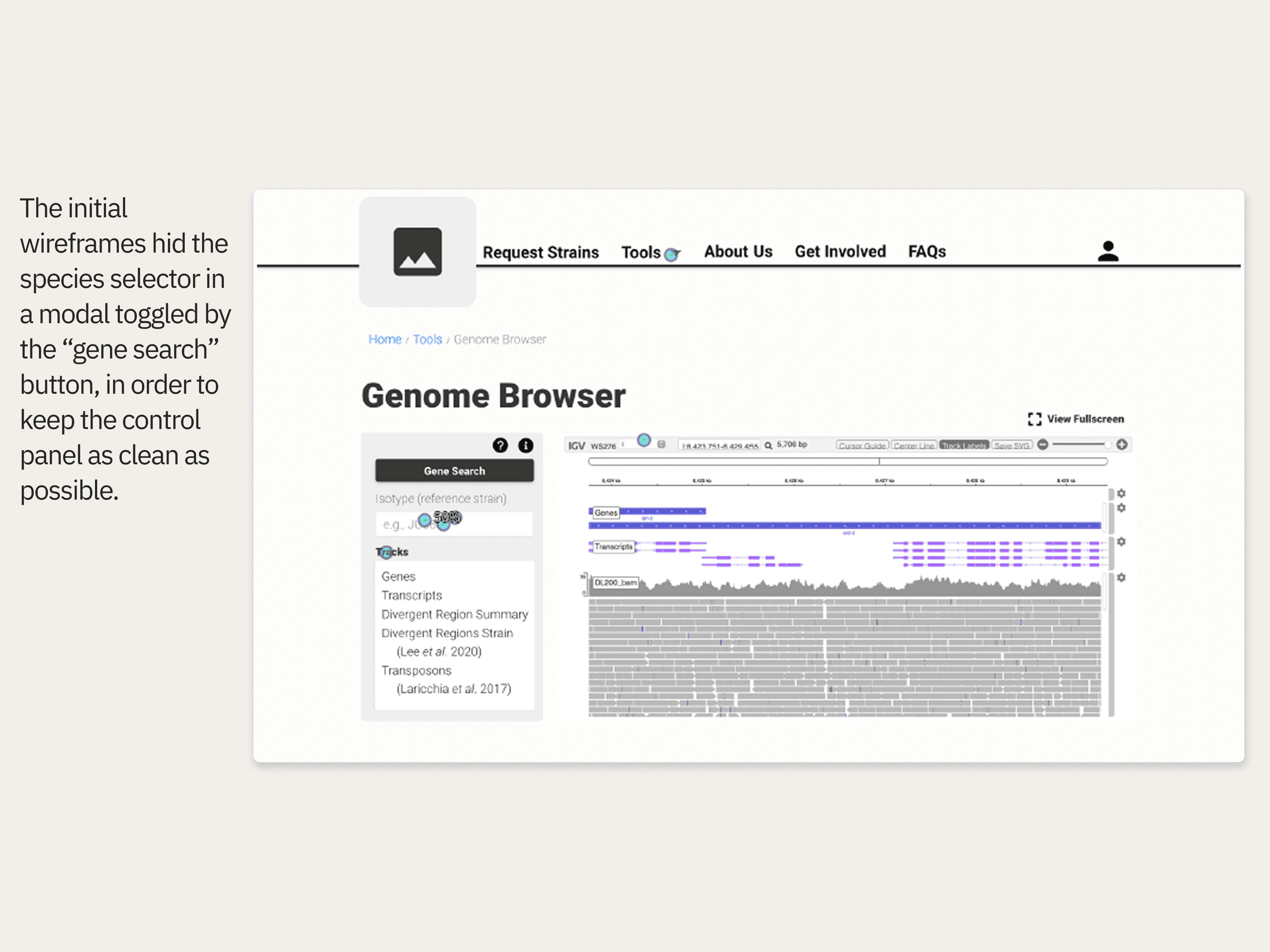
1st round wireframes: I focused on following standard design patterns by putting all controls and inputs in a panel next to the report. This allows users to see changes immediately, providing direct feedback and saving effort scrolling back and forth.
Iterative Breakthrough: From 0% to 67% Success
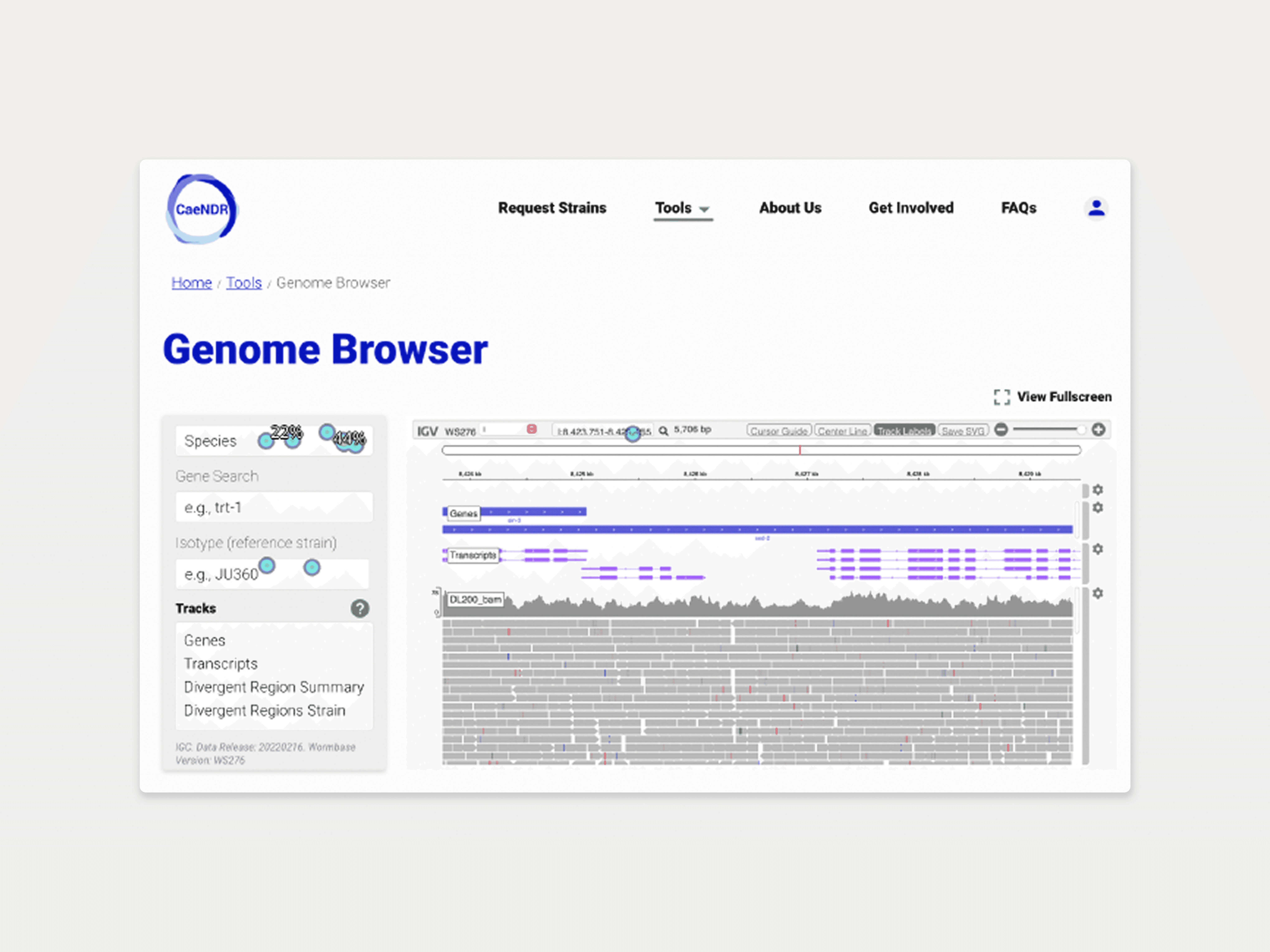
After redesigning the Genome Browser interface based on failure patterns, round two testing showed dramatic improvement: success rates jumped from 0% to 67% for species selection.
This taught me something crucial: in specialized domains, small workflow changes can break established user behavior patterns.
Other tools showed similar improvements.
The key was making species selection unavoidable rather than optional by putting the species selector out in the open and using visual hierarchy to guide users.
Round two of first-click testing showed success rates jump from 0% to 67%
Navigating Scientific Culture: The Credibility Challenge
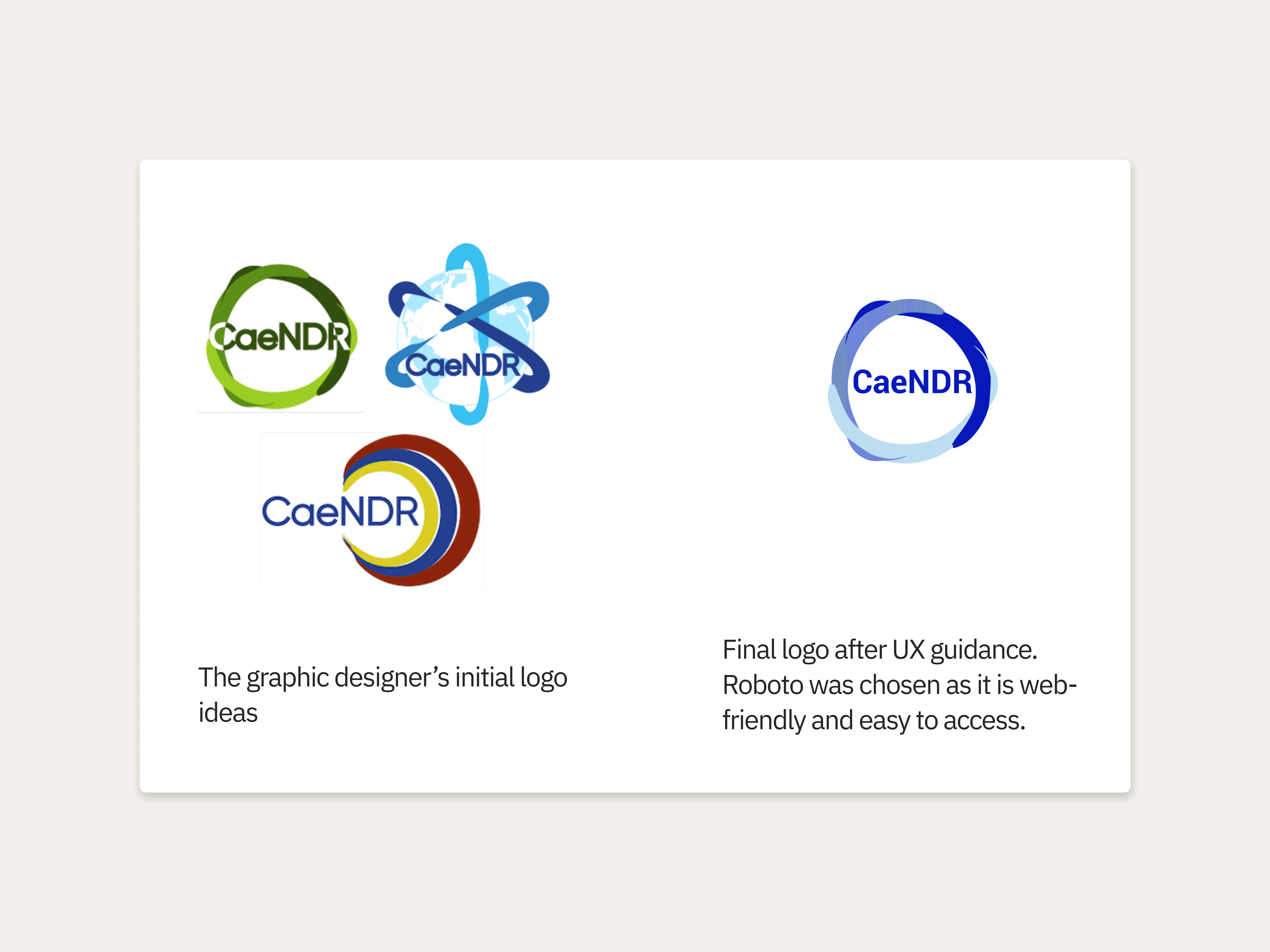
The scientific community presents a unique challenge: they can be skeptical of designs that appear "too polished," fearing style over scientific substance. I had to earn credibility through improved usability rather than visuals.
This was complicated by a three-way collaboration when Dr. Andersen independently hired a graphic designer to design a logo which would determine the branding for the site.
I guided branding decisions by focusing on practical constraints, explaining how certain color choices would impact web accessibility and adaptability across journals, presentations, and print materials.
Future-Proofing for Graduate-Student Maintainers
One of the most practical challenges: ensuring the site could be maintained by future graduate students without extensive design or development backgrounds. The system includes comprehensive guidelines and full code for page layouts and components.
I created a Bootstrap-based design system specifically for its extensive documentation and open-source nature, allowing non-experts to make updates safely.
The Stakeholder Revelation: Understanding True Value
I began by interviewing Dr. Andersen to better understand the tools offered on the site, the data requirements, and how CaeNDR fits into the larger scientific community.
These conversations revealed many insights. One of the most important was that Dr. Andersen revealed CaeNDR's unique value proposition which wasn't obvious from the interface: it's the only nematode database ensuring genetic diversity through global sample collection.
Most lab strains come from the same cultivated lines, but CaeNDR maintains samples from wild populations worldwide.
This insight completely changed my homepage design strategy, highlighting the global, diverse nature of the research rather than just listing available tools.
Homepage Redesign
A map shows the location of where nematode strains were collected for all 3 species. This information was readily available in the datasets but wasn’t previously utilized.
Users can filter the map by species.
Each species is coded with a different color. These colors are used throughout the site to differentiate species.
Clicking on individual pins shows a modal with further information about the selected strain.
The redesigned CaeNDR homepage
Hidden Complexity: Why Scientists are Different Users
Genomics researchers have different usage patterns than typical users. Google Analytics revealed something fascinating: users were laser-focused on specific tasks. They'd arrive, use one tool and then immediately leave without exploring other resources.
Conversations with Dr. Andersen revealed that this wasn't poor UX; it was the nature of scientific workflows that can span 2-4 years. A researcher might use the Genome Browser once in 2022, then not return to use another tool until 2024 when their experiment reached the next phase.
Google Analytics revealed...
3 out of 5 tools on the site are in the top 5 pages overall: Heritability Calculator, Variant Annotation, and Genome Browser.
This indicates that users overwhelmingly visit for the tools, with some users even relying on bookmarks or direct URLs for access.
High exit rates suggested either that users were experiencing usability issues or were solely task-oriented on their one tool.
Higher time spent on the Variant Annotation tool supported the hypothesis that CaeNDR’s users were task-oriented and engaging with tools.
Note: Heritability Calculator has low time on page due to a registration requirement to contain cloud-processing costs due to intensive data usage.
Strategic Testing Reveals Hidden Navigation Issues
Based on these insights, I streamlined the site’s navigation to promote quick access to tools and datasets.
A content audit of the original site revealed that tools were spread out amongst several different top-level navigation categories, which was inefficient for task-oriented users.
I proposed a new site navigation which clearly separated tools and datasets, and listed tools in the order in which they are used in the scientific workflow.
I validated the new navigation by conducting tree testing with 15 participants across 10 key tasks.
While most tasks achieved impressive 80-93% success rates, a couple of critical gaps emerged:
The Publications Confusion
Users weren't sure if the "Publications" page contained CaeNDR's own research or papers that had cited the platform, a crucial distinction for academic credibility.
The Citation Problem
Only 60% of users could find citation information, with participants scattered between Tools, About Us, and FAQ sections. For researchers who need to properly cite data sources in publications, this was a significant barrier.
The Species Selection Problem: Testing Assumptions
I then redesigned the tool interfaces, applying fundamental design principles and patterns to interfaces which had been created by non-designers.
One of the biggest design challenges came from what seemed like a simple addition. For years, users never had to select a species. C. elegans was the default option. Now, with three species, every tool needed a species selector.
Before: Tool interfaces were designed by graduate students; inputs and controls weren’t grouped thoughtfully according to standard design patterns.
First-click testing revealed a problem: 0% success rate on species selection. Users who remembered the old interface couldn't adapt to the new required selection when hidden in a panel. Users instead proceeded to try to select a gene first, as was the previous workflow.
1st round wireframes: I focused on following standard design patterns by putting all controls and inputs in a panel next to the report. This allows users to see changes immediately, providing direct feedback and saving effort scrolling back and forth.
Iterative Breakthrough: From 0% to 67% Success
After redesigning the Genome Browser interface based on failure patterns, round two testing showed dramatic improvement: success rates jumped from 0% to 67% for species selection.
This taught me something crucial: in specialized domains, small workflow changes can break established user behavior patterns.
Other tools showed similar improvements.
The key was making species selection unavoidable rather than optional by putting the species selector out in the open and using visual hierarchy to guide users.
Round two of first-click testing showed success rates jump from 0% to 67%
Navigating Scientific Culture: The Credibility Challenge
The scientific community presents a unique challenge: they can be skeptical of designs that appear "too polished," fearing style over scientific substance. I had to earn credibility through improved usability rather than visuals.
This was complicated by a three-way collaboration when Dr. Andersen independently hired a graphic designer to design a logo which would determine the branding for the site.
I guided branding decisions by focusing on practical constraints, explaining how certain color choices would impact web accessibility and adaptability across journals, presentations, and print materials.
Future-Proofing for Graduate-Student Maintainers
One of the most practical challenges: ensuring the site could be maintained by future graduate students without extensive design or development backgrounds. The system includes comprehensive guidelines and full code for page layouts and components.
I created a Bootstrap-based design system specifically for its extensive documentation and open-source nature, allowing non-experts to make updates safely.
Results
Results
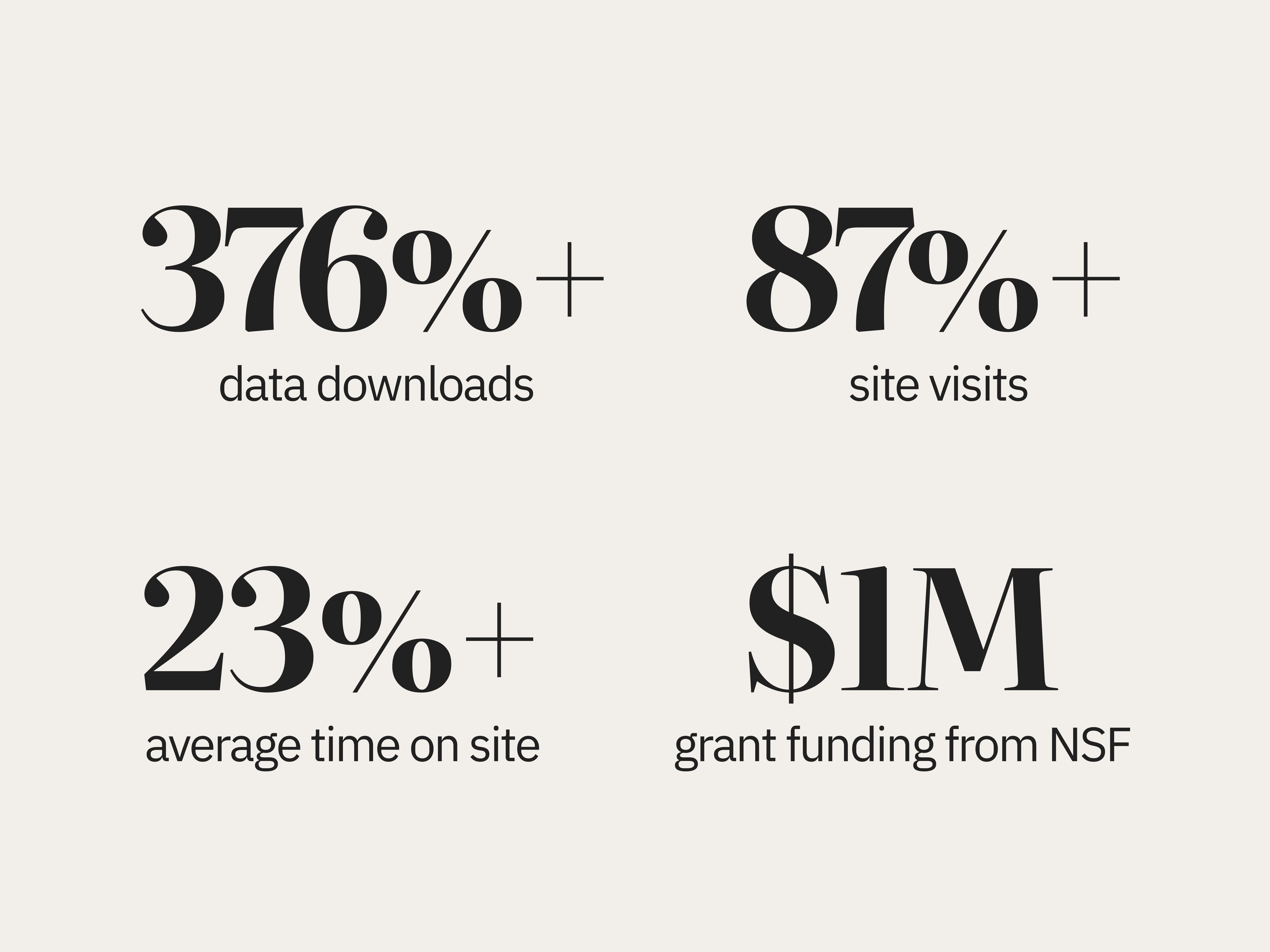
Three-months post launch, CaeNDR saw...
376% increase in data downloads (critical for NSF compliance)
87% increase in site visits
23% increase in average time on site
💡These critical design contributions ensured compliance with NSF requirements and resulted in almost $1 million in grant funding for Dr. Andersen and Northwestern University.
Qualitative Feedback
During the peer review process for Dr. Andersen's journal publication, anonymous reviewers specifically praised the site's usability, navigation, and accessibility—validation that the UX improvements directly supported the scientific work.
Navigating the CaeNDR website is exceptionally easy and intuitive.... It is evident that [the team has] put a lot of thought and effort into ensuring smooth operation. CaeNDR offers great tools and functionalities that impact and streamline every decision a researcher must make and every challenge they may face. From relatively minor tasks like finding suitable genetic markers and calculating heritability to the most challenging ones… this platform provides comprehensive support. It is clear that this platform will be heavily used and cited.
Scientific Success
One of the most important measures of success for academic researchers is being published in a top peer-reviewed journal. As a result of the team’s effort, Dr. Andersen and the team published an article about CaeNDR in a prestigious scholarly journal.
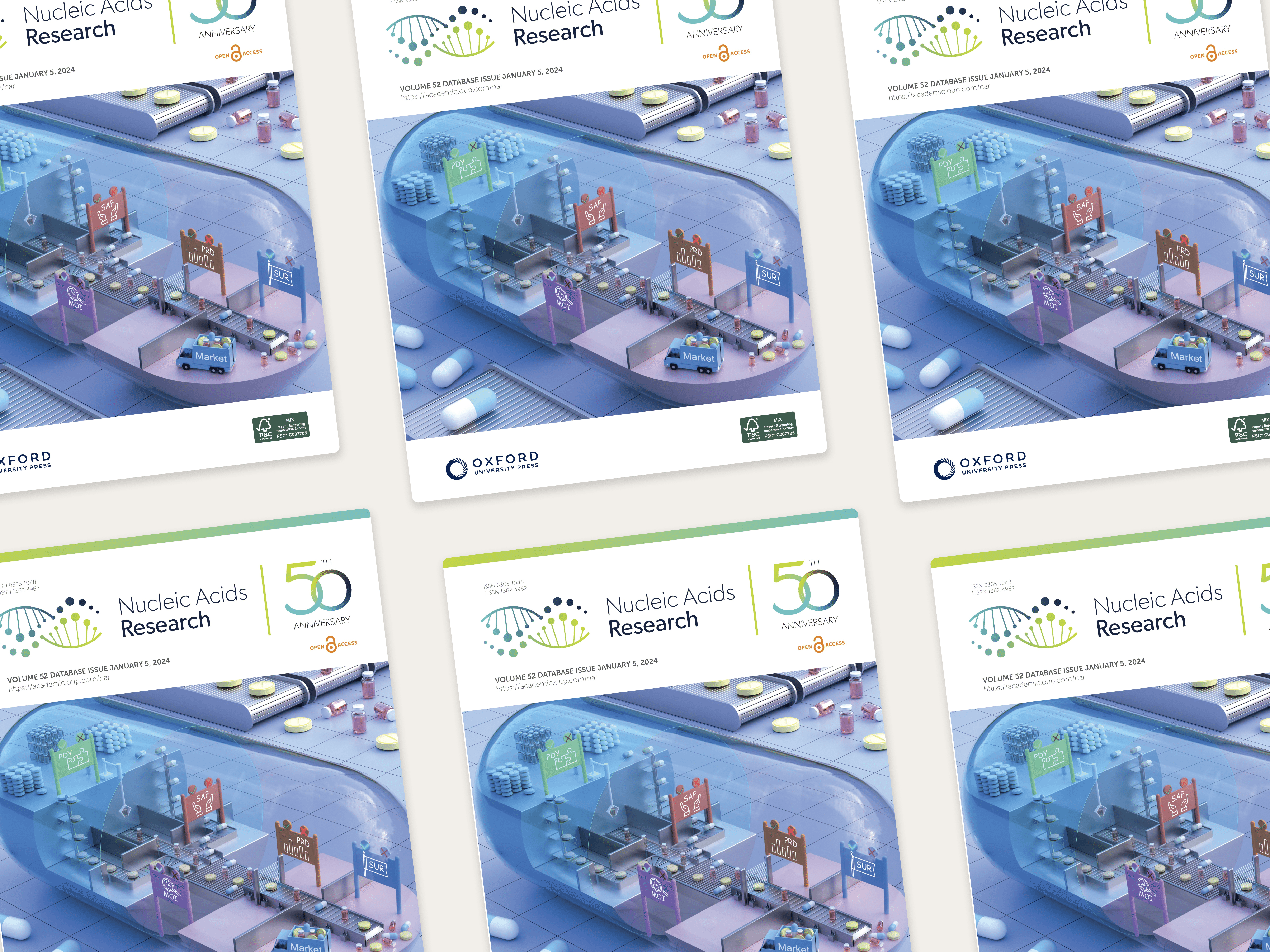
CaeNDR, the Caenorhabditis Natural Diversity Resource
Timothy A Crombie, Ryan McKeown, Nicolas D Moya, Kathryn S Evans, Samuel J Widmayer, Vincent LaGrassa, Natalie Roman, Orzu Tursunova, Gaotian Zhang, Sophia B Gibson, Claire M Buchanan, Nicole M Roberto, Rodolfo Vieira, Robyn E Tanny, Erik C Andersen
(2023 Oct 19) Nucleic Acids Research
Lessons Learned
This project reinforced that improving existing products often creates more value than building from scratch. In highly specialized domains with small user bases, leveraging available data sources and stakeholder expertise can be more effective than extensive user research. By focusing on systematic testing and sustainable design systems, we transformed a functional but frustrating platform into something researchers actively wanted to use, creating a foundation for future innovation and empowering researchers around the world to share, discover, and advance insights into evolutionary biology.
Three-months post launch, CaeNDR saw...
376% increase in data downloads (critical for NSF compliance)
87% increase in site visits
23% increase in average time on site
💡These critical design contributions ensured compliance with NSF requirements and resulted in almost $1 million in grant funding for Dr. Andersen and Northwestern University.
Qualitative Feedback
During the peer review process for Dr. Andersen's journal publication, anonymous reviewers specifically praised the site's usability, navigation, and accessibility—validation that the UX improvements directly supported the scientific work.
Navigating the CaeNDR website is exceptionally easy and intuitive.... It is evident that [the team has] put a lot of thought and effort into ensuring smooth operation. CaeNDR offers great tools and functionalities that impact and streamline every decision a researcher must make and every challenge they may face. From relatively minor tasks like finding suitable genetic markers and calculating heritability to the most challenging ones… this platform provides comprehensive support. It is clear that this platform will be heavily used and cited.
Scientific Success
One of the most important measures of success for academic researchers is being published in a top peer-reviewed journal. As a result of the team’s effort, Dr. Andersen and the team published an article about CaeNDR in a prestigious scholarly journal.
CaeNDR, the Caenorhabditis Natural Diversity Resource
Timothy A Crombie, Ryan McKeown, Nicolas D Moya, Kathryn S Evans, Samuel J Widmayer, Vincent LaGrassa, Natalie Roman, Orzu Tursunova, Gaotian Zhang, Sophia B Gibson, Claire M Buchanan, Nicole M Roberto, Rodolfo Vieira, Robyn E Tanny, Erik C Andersen
(2023 Oct 19) Nucleic Acids Research
Lessons Learned
This project reinforced that improving existing products often creates more value than building from scratch. In highly specialized domains with small user bases, leveraging available data sources and stakeholder expertise can be more effective than extensive user research. By focusing on systematic testing and sustainable design systems, we transformed a functional but frustrating platform into something researchers actively wanted to use, creating a foundation for future innovation and empowering researchers around the world to share, discover, and advance insights into evolutionary biology.